Inspiration meets impact.
Dance4Life Identity & Brand Guidelines
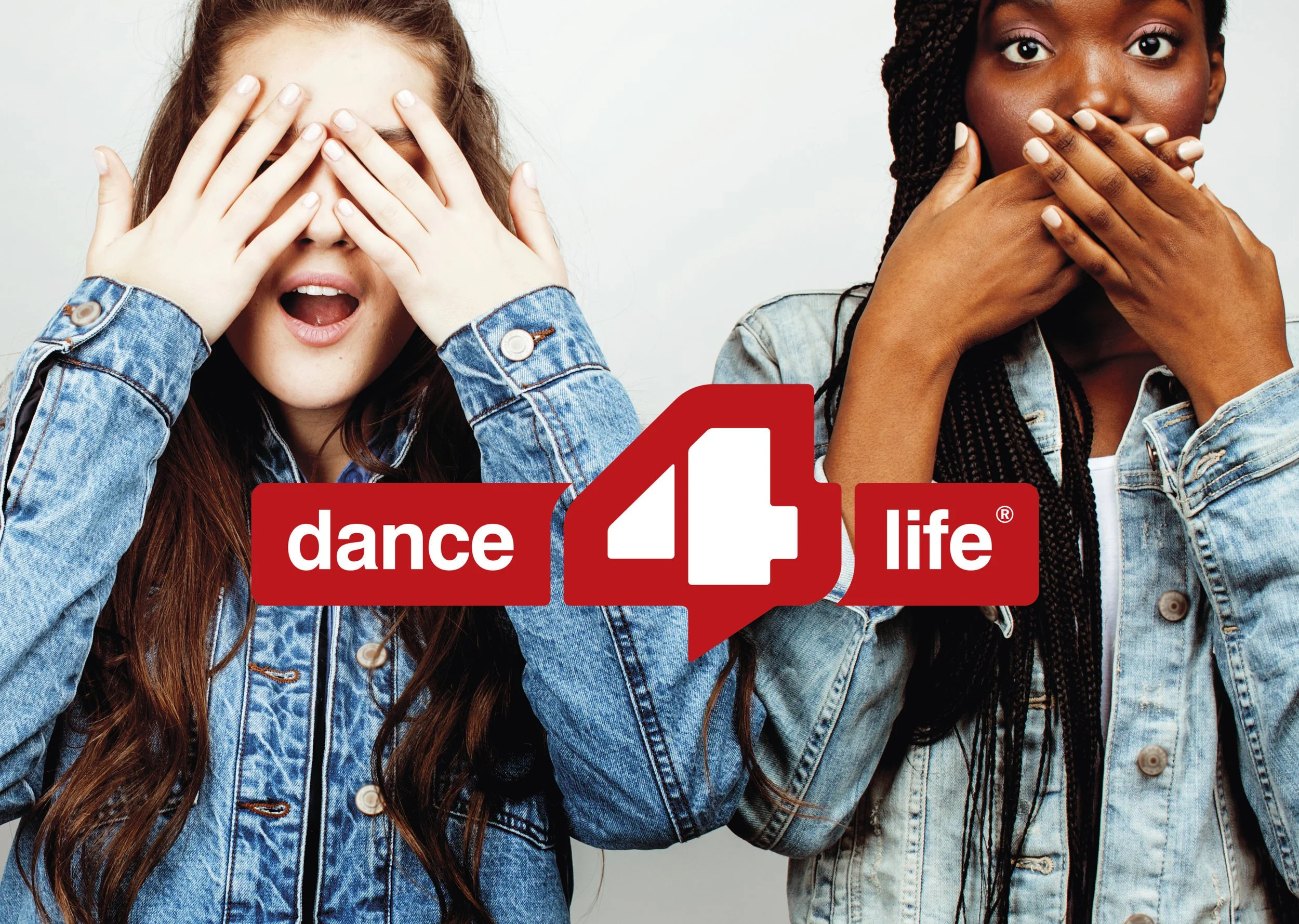
Dance4Life stands as a beacon of empowerment, illuminating the path for young people as they navigate the complexities of sexual health and confidence. Our journey with them was more than a mission; it was a heartfelt commitment to position Dance4Life as a credible partner in the eyes of NGOs worldwide. We embraced the essence of empowerment, infusing it into every strand of their brand story, breathing life into a personality that resonates with authenticity.
A fresh visual identity and a set of thoughtful naming guidelines were the creative conduits that transformed Dance4Life's image. These elements worked in harmony to showcase their credibility, not just as a brand but as a trusted partner, empowering youth with knowledge, confidence, and the freedom to thrive.
Expertise
Brand Strategy I Communication I Brand Design I Brand Guidelines I Creative Direction
Client
Dance4Life
Year
2018
Creative solution
We began by establishing a powerful and clear new brand story, a distinctive voice, and a consistent design style for all touch points.
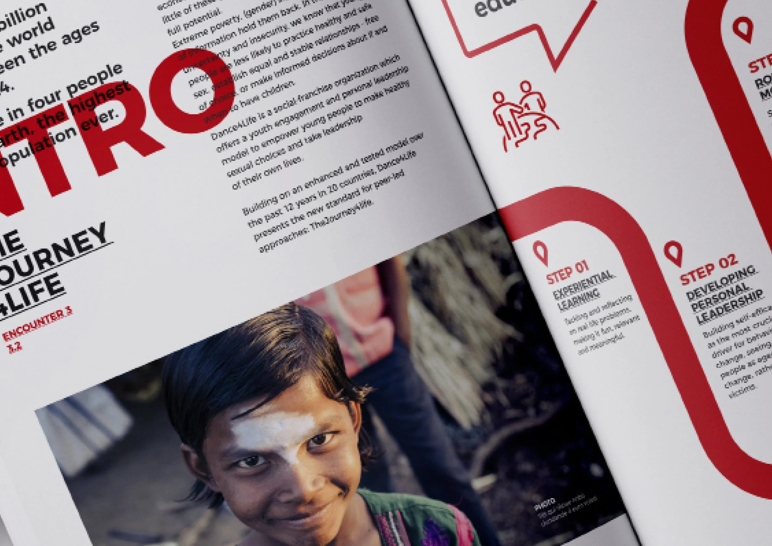
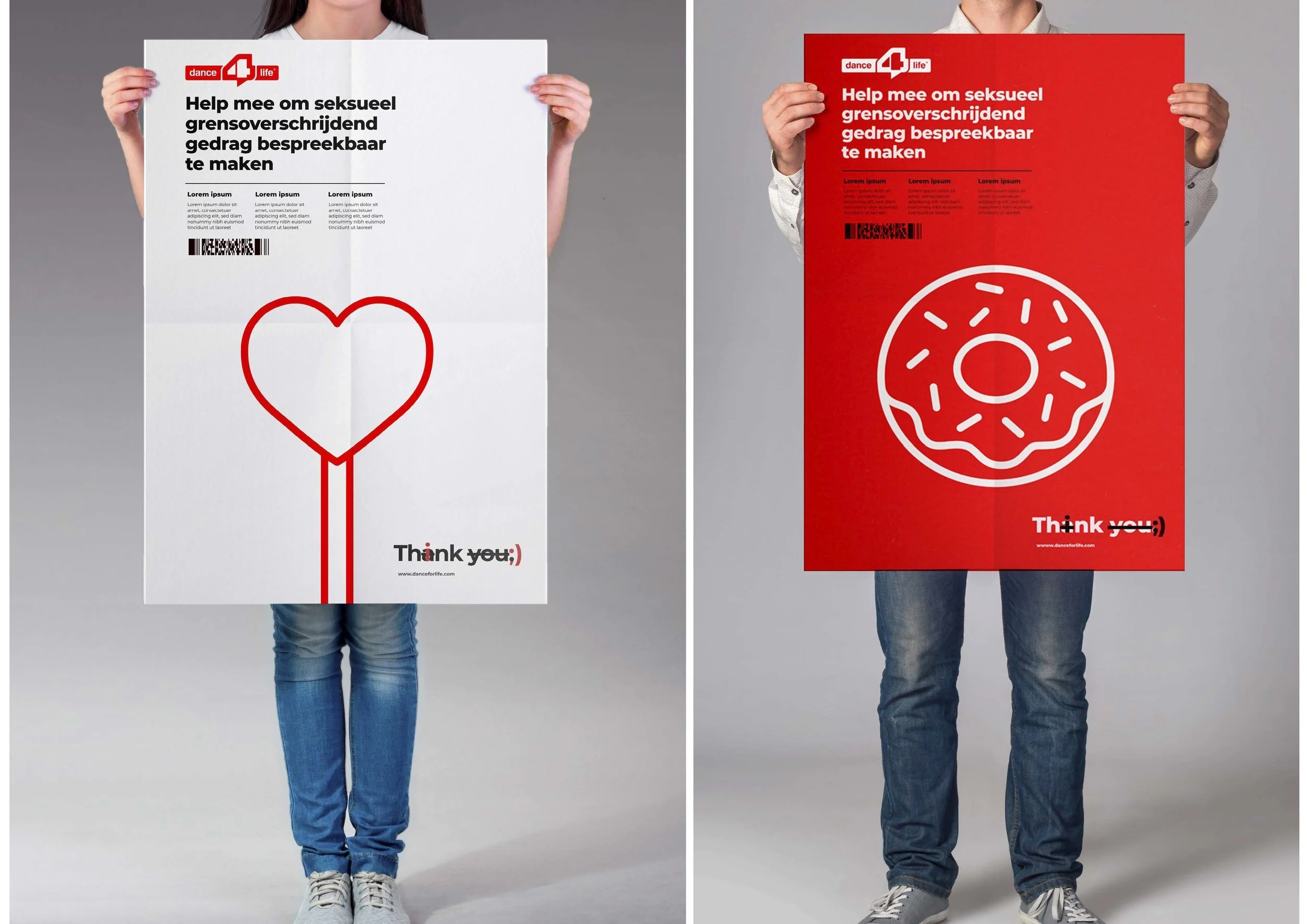
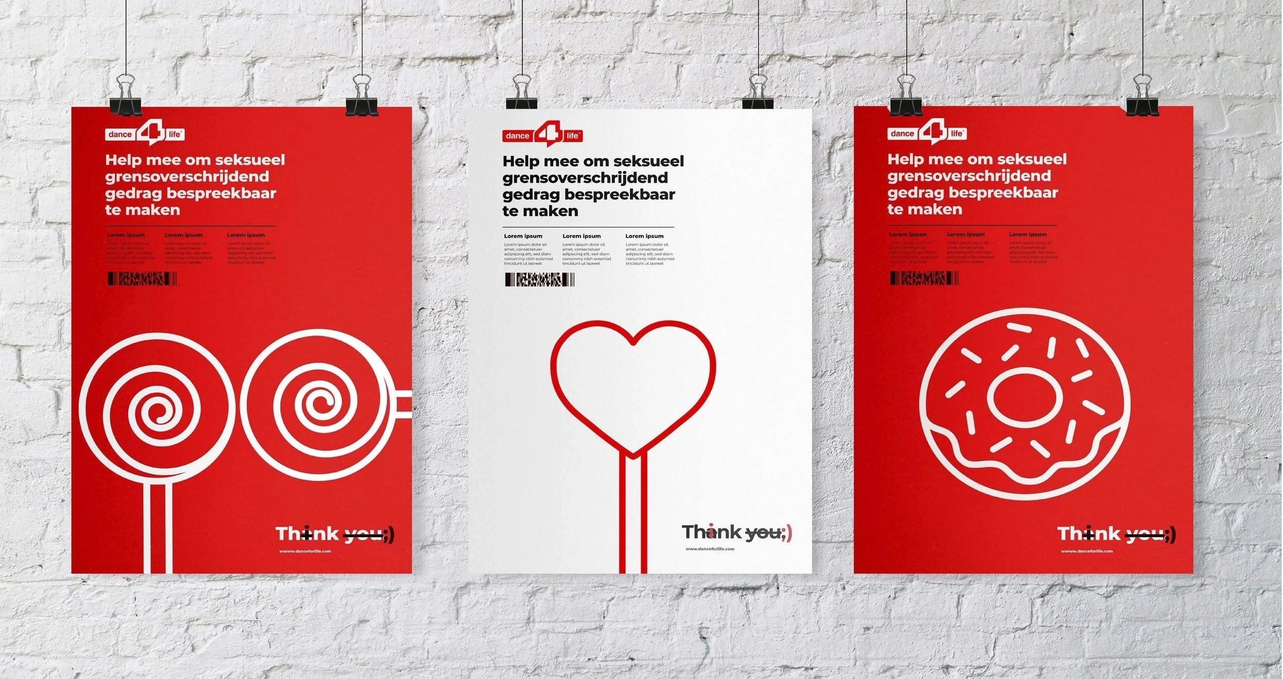
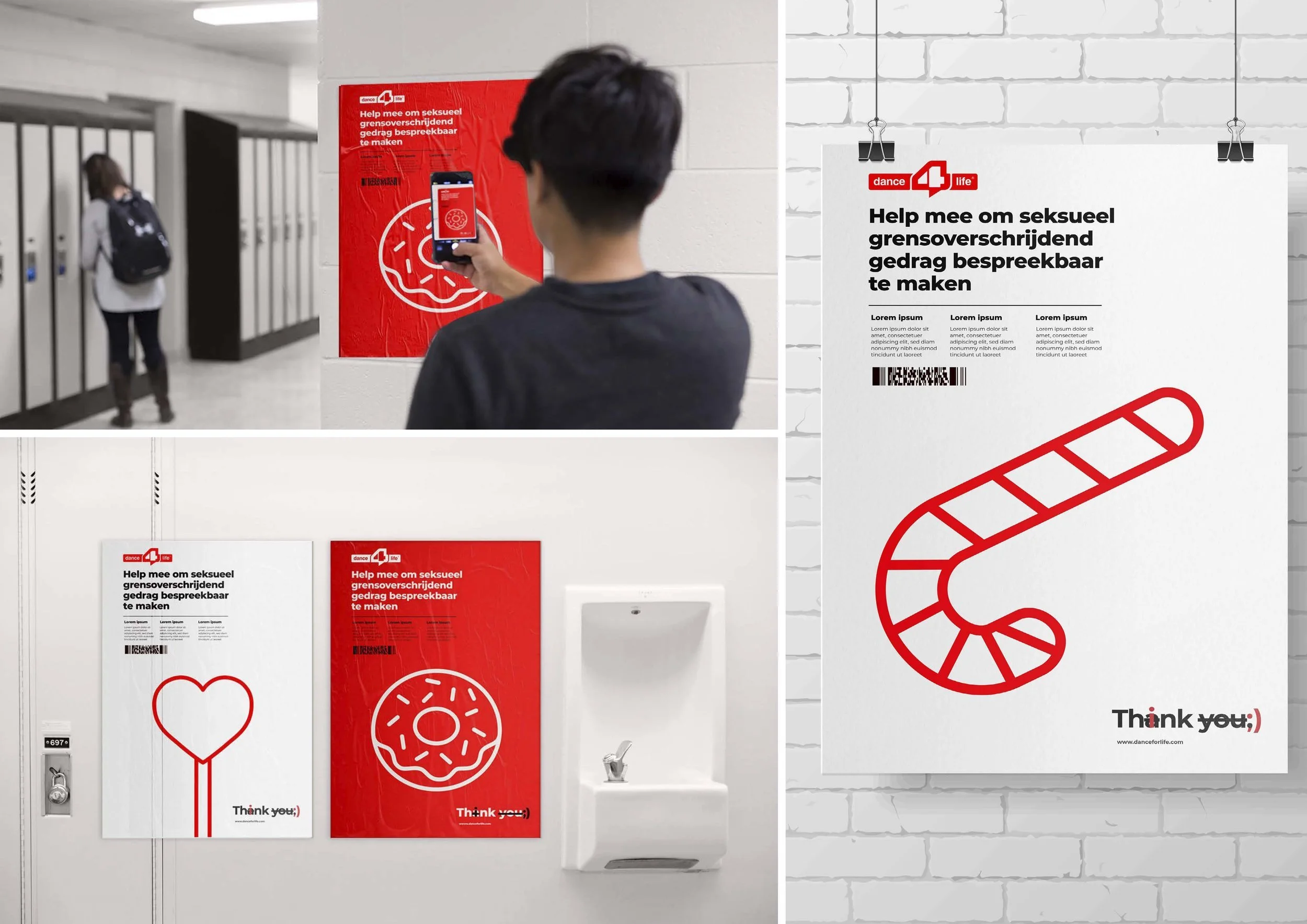
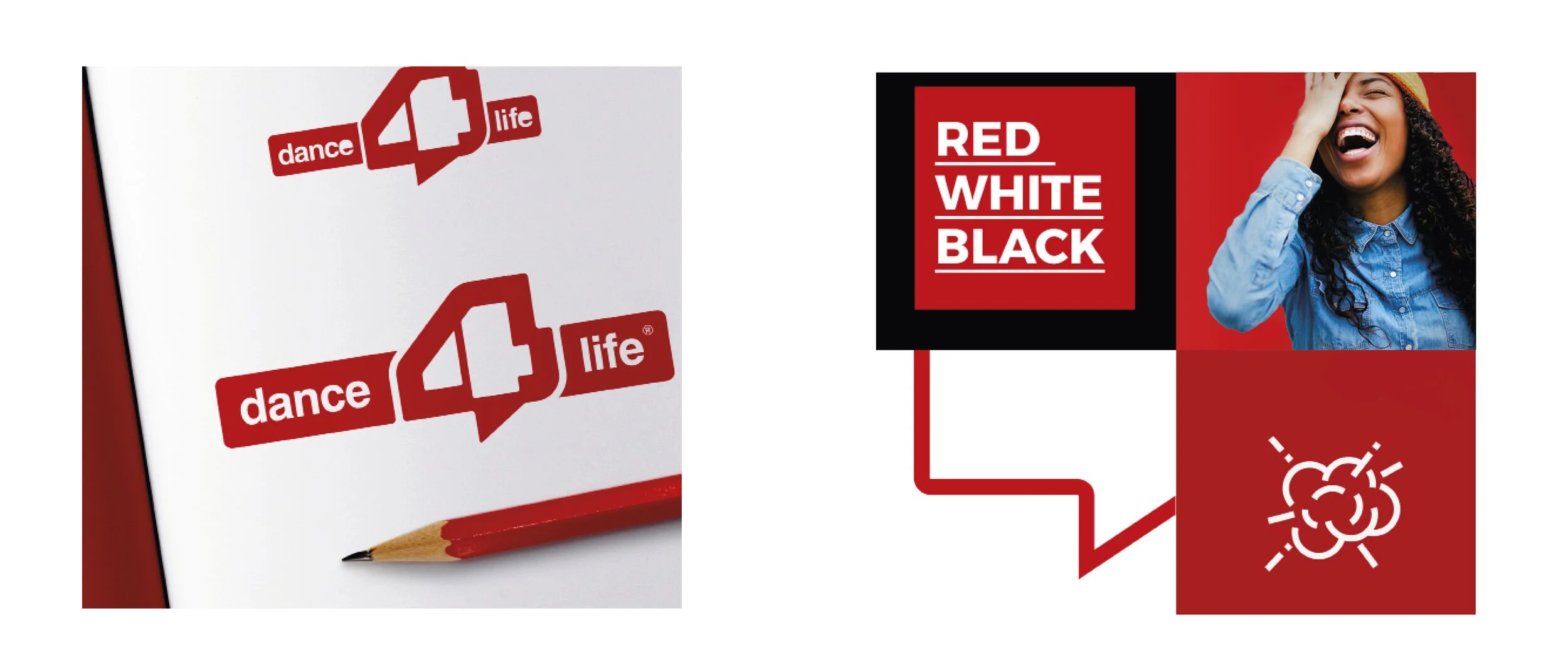
Our creative idea focused on building further on the iconic 4 and their speech bubble - both fundamental pillars of the brand, standing for empowerment and the real stories there are to tell.
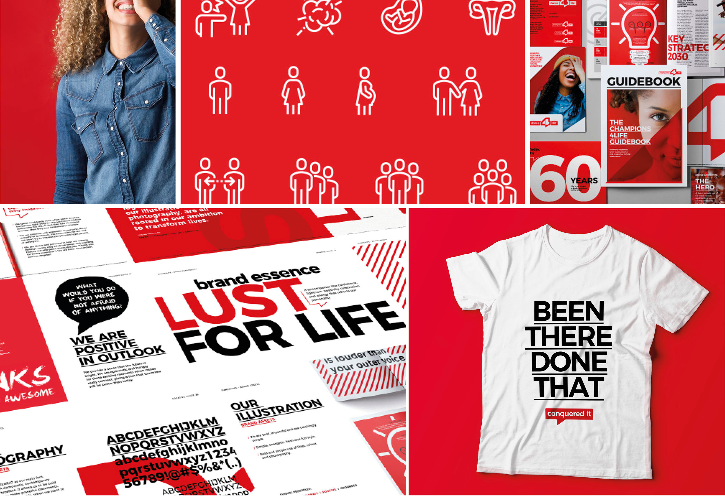
A refreshed identity
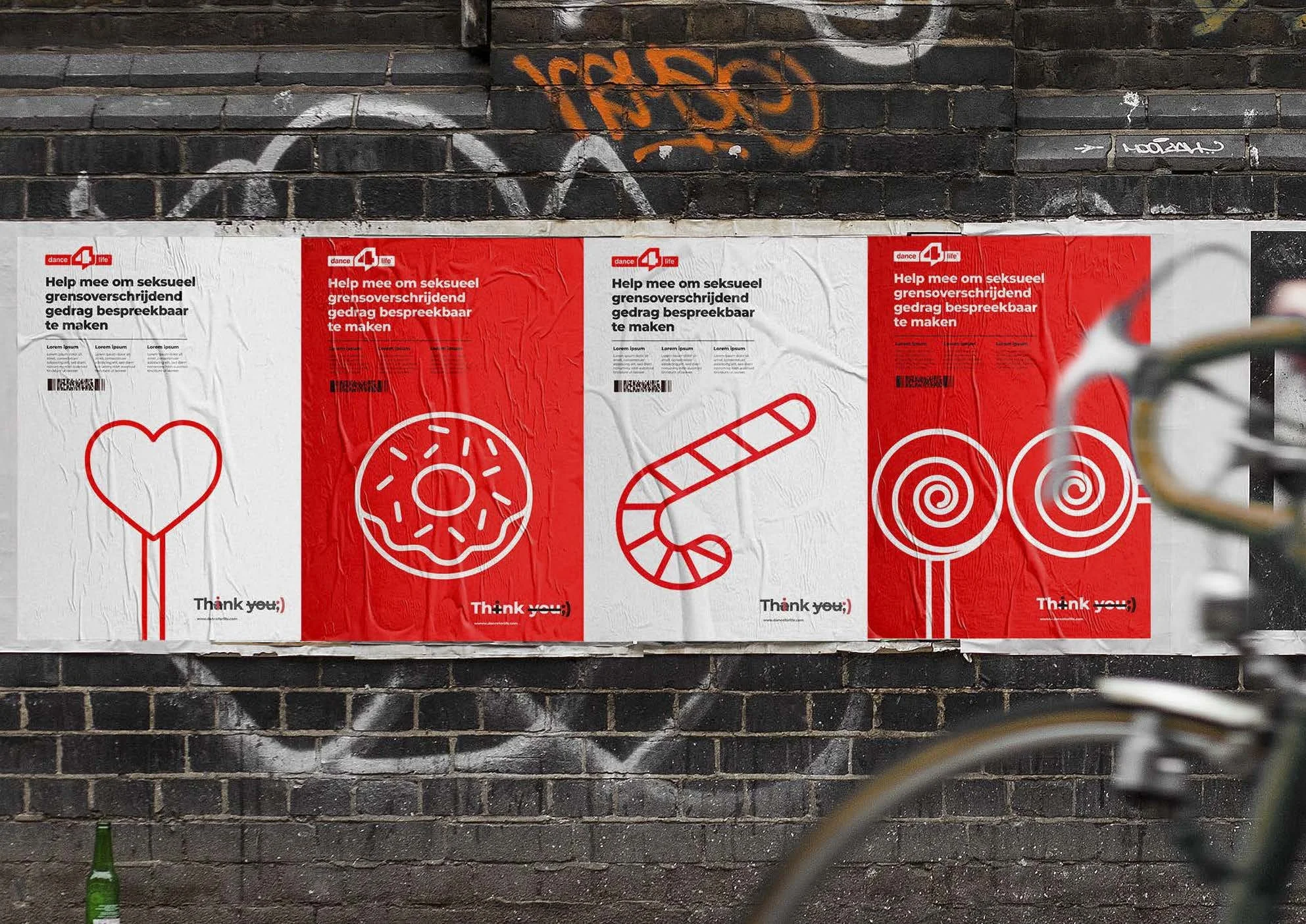
The logo has been refined keeping it simple and bold, the 4 has been redrawn into a more balanced, and iconic shape without compromising its continuity. The 4 is a fundamental part of the brand which can be used as a stand-alone element capable of carrying the brand’s energy across a variety of different touch points.
We added to the story by reinforcing the dialogue by hiding interacting speech bubbles within. For stand-alone purposes, the speech bubble has been further developed as it is key to the brand for its self-expression and it belongs to young people.
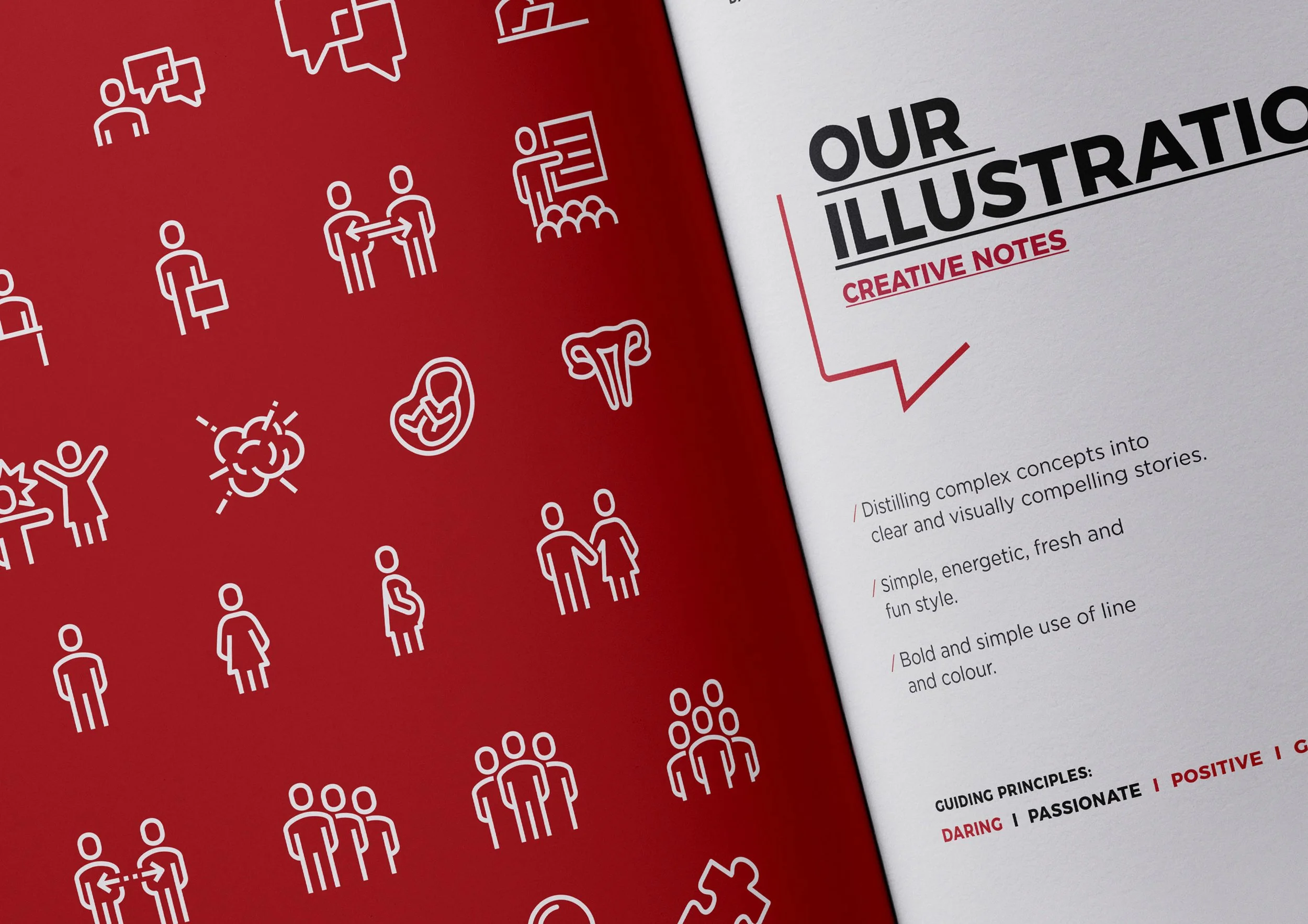
A consistent visual style
Due to their shift in target audience, it’s even more important now than ever to have a unified visual identity and clear brand voice. From the logo to the tone of voice, illustrations & photography, all are rooted in the ambition to transform lives and reflect our ‘energizing champion’ personality.
Red, white and black, remained the brand colours, being simple and bold. These colours bring impact and positivity. To show contrast and change we have chosen a duo-tone palette. This simple colour approach creates a level of consistency across all touchpoints.